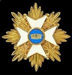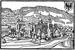
It's surprising how time consuming these map symbols are - tweaking and fiddling with them takes longer than the drawing. Anyway, here's the palace-fortress with some shading applied and minor tweaks, plus a tower house and a windmill, still in progress.
Friday, 16 January 2009
Map Symbol Progress (Slow!)
Posted by
David Morfitt
at
Friday, January 16, 2009
![]()
Subscribe to:
Post Comments (Atom)


David,
ReplyDeleteTo my mind the smaller symbols are more usable for maps. Something for cities, towns, castles, forts, villages and farms should suffice for structures in many cases.
However it would be nice to have the same ones with blue roofs and red roofs (and maybe yellow and green roofs) so that they could be used fir different nations.
Symbols for trees, fields, hills and mountains might also be a good idea.
But do whatever you like.
-- Jeff
Nice work! I especially like the windmill :-)
ReplyDeletesir David,
ReplyDeleteI agree with Fitz-Badger, I like the windmill! Bluebear Jeff may have something about size of large structures. Even the wonderful large map Fitz did of the Reich Duchy of Beerstein would be hard pressed to accommodate such a grand palace. Although Wilhelm certainly deserves all the splender you can create...Bill
Tower house and windmill are my favourites. I would like to see bridges and perhaps a harbour for nations with a coastleine. Keep up the good work sir!
ReplyDeleteAlan
I really like these symbols. They remind me of the maps I made in the early, early days of gaming, a style I've been trying to recapture ever since.
ReplyDeleteHello there David,
ReplyDeleteThe shading is an effective improvement, and the fortress and tower look even neater thanks to it. I really like that windmill! I think Stollen and its neighbors need some of these on the map, which I have delayed revising for some time now. What new symbols are coming next?
Best Regards,
Stokes
Hi Jeff,
ReplyDeleteYou make good points. I'm still experimenting, really, and learning what style works. I would like to say, though, that the large palace/fortress is not so unuseable on maps because of the magic of vector graphics - objects can be resized dramatically and still appear sharp and clear, because vectors are mathematically defined, not collections of pixels like raster or bitmap images, which degrade horribly when enlarged or shrunk.
Your list closely matches the one I have been putting together. :-) It will be some time before I complete it, though, as these images may look simple but a lot of work goes in to producing them in their final versions.
All the best,
David.
Thanks, FB and Captain Bill! :-)
ReplyDeleteBridges are on the To Do list, Alan, and I'll add a small harbour to the list. That windmill is certainly a popular item!
Thanks, AJ.
Thanks, Stokes. I think next I'll be working on some town and village houses, as well as further town and city symbols. I'll be doing a star fort as well as a city with "modern" (i.e. 17th/18th century) earthwork fortifications, rather than mediaeval walls.
That windmill *is* popular! :-)
All the best,
David.
A while back (in the early 90's actually) I produced a few symbols of my own, for use with my medieval campaign game - no colour, just sketches so that I place them onto the battle maps. Your symbols triggered the memory, so I might search them out and post them.
ReplyDeleteThanks for all your hard work. Keep it up.
Steve
Thanks, Steve. Yes, do post your symbols - very interesting to see them. :-)
ReplyDeleteDavid.