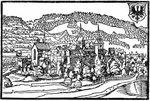
Well, after the initial shock of realising that my map symbols suffer from some form of progressive elephantiasis (see comments on previous posting - we were in danger of reaching 1:1 scale designs ;-)), I've been rethinking the strategy and have been looking into designing a font for map symbols rather than graphics symbols themselves. This may be complete insanity (or lead to complete insanity) but it would have the advantage for users that they could drop the symbols into almost any program they are using for drawing maps and not have to convert my symbols into some format or other than .svg before they can use them. It would have the advantage for me that the very format restricts the potential size and complexity to some extent. A possible disadvantage is that the font would be black and white and users would need to do all the colouring for themselves but that should be relatively easy. I've found a free font designer that may be up to the job (whether or not I will remains to be seen!). More on this as I work my way through the program and try to produce something... If anyone has any thoughts, ideas or experience to share, I'd like to hear them; thanks!
In the meantime, I'll also be back to drawing more templates and flags; but at this moment I need to get a cat's details and photograph on to the rehoming page of the cat rehoming charity for whom I do the website, and then to bed as it's nearly 3.30am here. :-)
Wednesday, 28 January 2009
More thoughts on map symbols...
Posted by
David Morfitt
at
Wednesday, January 28, 2009
![]()
Subscribe to:
Post Comments (Atom)


I've played around a bit with Font Creator, a pretty inexpensive but fully-featured font creation application. I have made symbols with it in the past (and even started work on a font) when I was doing more fantasy stuff, but my current round of map-making was done in Illustrator and Photoshop, without using fonts, because each city symbol was unique. But I'm really just a dilletante in this (as in much of what I do in the hobby realm).
ReplyDeleteI'm looking forward to seeing what you come up with!
I must say all of your efforts are way beyond my understanding, so I unconditionally support your efforts....Bill
ReplyDeleteDavid
ReplyDeleteMost interesting - like the previous poster this is all way too technical for me- but I am finding it fascinating and await developments wth great interest...
Alan
p.s I look forward to the scans too.
Hi FB,
ReplyDeleteThanks for your comments. I'm very much a dilettante too! :-) Having done a bit of exploring of the font option I'm beginning to think that the clipart route is simpler - there's so much to learn about fonts! So it's back to Plan A, probably - possibly - not sure.
With the very weak pound, Font Creator is a lot more expensive than it was 6 months ago, sadly, so that's not currently an option.
When you say "started work on a font" do you mean it was complicated and you gave up or am I reading too much into your comment? ;-)
David.
Hi Bill and Alan,
ReplyDeleteThanks for your comments and interest. As I've just said to FB, it looks like a return to Plan B as the font option just seems too complex for the time and energy I have at the moment. But map symbols there will be at some point soon!
All the best,
David.
P.S. I'll get sending those scans sorted ASAP, Alan. Been intermittently out of action with leg trouble for a day or two so things are slow presently, I'm afraid.
By started I just mean I got part way and then got side-tracked into other interests/ideas. I found Font Creator pretty easy to use, especially for symbols. But it takes more work to make sure fonts and font metrics and all work correctly to produce the right effect (making sure letterspacing, kerning, etc. all work together so lines of text look good). I expect to pick it up again some day.
ReplyDeleteHi FB,
ReplyDeleteThanks for the clarification. My comment was a bit "tongue in cheek". ;-)
Yes, it's all the complexities (some of which you mention) that in part made me think I'd be better off with my vector drawing program, unless I really wanted to get stuck into a steep learning curve on font making - which, frankly, at the moment I don't! What happened to the symbols you worked on? Did you use them or even release them as PD?
David.
David
ReplyDeleteNo worries re scans- whenever you are feeling more able...
best wishes
Alan
Thanks, Alan. I'll sort it out ASAP.
ReplyDeleteAll the best,
David.
I used some mountain symbols I made from scans from old maps (16th century stuff) in some maps back before I got into the SYW era.
ReplyDeleteThat was back when I was working on a map of my Island of Smorgasbergen, an island inhabited by Norse Dwarves, descendents of the original founding group led by Smorgas Herringsbane.
Hi FB,
ReplyDeleteYes, that's the sort of material I've been looking through, to get inspiration. Any chance of seeing the symbols you did, please? :-)
Ah - RPGs. Loved those in the past (especially FGU's Bushido) but it's so hard finding a decent group of reliable people to play them with.
David.
Just for you I can email you a couple of unfinished fonts - one with a few mountain symbols and one with an italic typeface. Both based on Mercator's work.
ReplyDeleteSorry, FB - losing track of all the comments in different places on the blog so didn't catch this until now! Thank you; I'd be very interested to see what you've done. Can you email them to: morfitt [at] lineone [dot] net, please? Best to put something like "FitzBadger Fonts" in the subject line so I can tell the email from all the spam that pours in!
ReplyDeleteDavid.