UPDATE 13th January 2014: As people are likely to have missed my latest comment here it is:
Well, here we are in a grey and dismal January - and I've had plenty of
time to consider where to go with the grey shading on the flags. I've
decided on a classic compromise (which used to be a British tradition).
I'll tone down the grey, probably to somewhere between medium and light.
I'll need to experiment. And as FB said, people can always print the
flags out lighter anyway.
Cheers,
David.
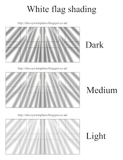
Der Alte Fritz has posted a comment on my latest flags, those of the French regiment Provence, asking me to tone down the grey shading as he thinks it too strong and that there should be "a more subtle transition from the basic white color". I'd be interested to know what others think on this as I've been trying various strengths of grey shading on the white areas of the flags and on the completely white flags, as some people may have noticed.
I've been vaccillating over what works best. Lately I've preferred the darker shading as it seems to me that, especially on a flag that will be around 3-4cms square in use, a more subtle shading will simply not show too well at all. And as you can see if you put "white flag" into Google images, in the real world it very much depends on a subtle and complex combination of light and material how dark the shadows in white flags look. A thick material in bright sunlight can have very dark shadows whereas a light material in bright sunlight will probably often have light shadows as much of the light travels through it rather than leaving surface shadows. And so on. (As 18th century French infantry flags were of thick pieces of silk taffeta sewn together I suspect they would show dark shading in bright light.)
So, I'd like to know what people think; do lighter greys work better than dark on these white wargames flags? I've posted an image here showing 3 different levels of shades of grey on a white French flag to give an idea of possible variations and to help people see those variations in contrast to each other.
Cheers,
David.
Thursday, 5 December 2013
Shading white flags; a question of greys...
Posted by
David Morfitt
at
Thursday, December 05, 2013
![]()
Subscribe to:
Post Comments (Atom)


David,
ReplyDeletePersonally I think the lightest shading looks better to my eyes.
Jim
The medium one looks best to my eyes. However that is not to suggest that your recent Rossbach flags haven't been stunning. They are lovely pieces of work.
ReplyDeleteBest Regards,
Stokes
I like the lighter shade best, to me I notice the white cross more on the light flag, but its not so noticeable on the darker flag, my eyes are drawn more to the wave pattern.
ReplyDeleteHope this helps???
I would go one shade lighter than the lightest of the three samples just to see how it looks. Check out the subtle shading in the uniform plates of the French soldiers that you have featured over the past several posts, as an example of what I mean.
ReplyDeleteAnother possibility is that having fewer "folds" would minimize the zebra stripe effect on the flags.
Oh dear, I hope that I have not started a flag shading kerfuffle.
Just to be unhelpful, the depth of shade on the white flags will have to match the same tones as on the coloured flags. In real life they're (generally) made of the same material and they're flown in the same conditions, in the same unit.
ReplyDeleteThe depth of shading will depend on the depth of the folds, surely? More 'active' flags will have shallower folds, so lighter shading. Next time you're people watching have a look at their clothes.
To some extent it will depend on how the flags are converted from digital to analog forms. For example, if someone prints the flag the printer they use might make it come out darker or lighter than what they see on their screen. It shouldn't be difficult for people to lighten or darken the images in various graphics applications (like Photoshop or many other image/raster applications; even some free ones).
ReplyDeleteHaving said that, I'd probably go with the medium one. But that's partially based on my experiences with my own flags and and my printer.
When it comes to flags I say leave them to their own devices! ;-)
Sir David, The size of the flags on the battlefield need to show enough contrast to be seen. Keep up the good fight...
ReplyDeleteDavid-
ReplyDeleteI prefer the lighter of the shadows,but then again, the example is being shown as a "flat" flag. When I put flags on my models I usually bend them up some to give them some "flap". This causes natural shadows as well, which may very well be darker in contrast.
If you were not adding flap, then I'd go for as high as the medium, but think the dark- although very contrasty, is too dark.
The other factor could be the color of the shading. Is the material linen, silk, etc. Different materials give/are out different colors. Maybe way too esoteric for this conversation though.
My two shillings worth,
Regards,
Thomas
Thank you all for your comments. I'm busy for the next couple of days so will not have chance to post but that gives me time to ponder my reply.
ReplyDelete(And also gives any others who would like to comment time to do so...)
Thanks again.
Cheers,
David.
I think Der Alte Fritz just sparked a new imaginations campaign: The Fahn Kerfuffle wars!!!
ReplyDeleteCheers
Ths
Thanks to nba-sywtemplates.blogspot.ru
ReplyDeleteWhile all your work is great, I'd go with the lighter shade. Have a safe and Happy New Year.
ReplyDeleteAnd yes, the Fahn-Kerfuffle Wars would no doubt be a wonder to behold! All that fighting over sartorial arguments... I like it.
ReplyDeleteCheers,
David.
Well, here we are in a grey and dismal January - and I've had plenty of time to consider where to go with the grey shading on the flags. I've decided on a classic compromise (which used to be a British tradition). I'll tone down the grey, probably to somewhere between medium and light. I'll need to experiment. And as FB said, people can always print the flags out lighter anyway.
ReplyDeleteCheers,
David.
Is it alright to submit some of this on my website if I include a reference to this web page?
ReplyDeleteI'd really need to know more before giving any permission to use my material. What is your website and why would you like to "submit" some of my material on it? Wouldn't a simple reference to my post on your website possibly do instead?
ReplyDeleteCheers,
David.